When World Domination Goes Wrong – Colours and Words

You might know me from such blog post as “Lost in translation or on the path to world domination”. You know the one, dimmed lights, dominos and a fat cat, box reading and wishing to be Chinese, yep exactly that one.
Last time we learned how important it is to localise your SEO efforts, which means to ensure you know what the people in the country you are targeting are really searching for, where to find them and how to optimise to get to them. And a big take-away from the blog post was “Translation = Bad”.
Well today I would like to talk about the targeting part of the mix, especially around colours and the choice of words. If you want to get back into world domination mood - now would be a good time to dim those lights, adjust your dominos and get that fat cat back… let’s delve together into “When World Domination Goes Wrong”….
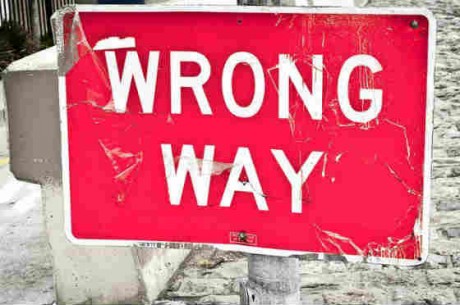
If you read my last blog post and started walking the path to world domination – I am sorry to tell you – it can still go wrong. If you have done everything I told you last month and you are set up to roll – HOLD THE PHONE there are still a couple of things you’ve got to look out for. Those go back to some good old marketing theory before the time of Digital (yes I know I keep on throwing shocking revelations at you).
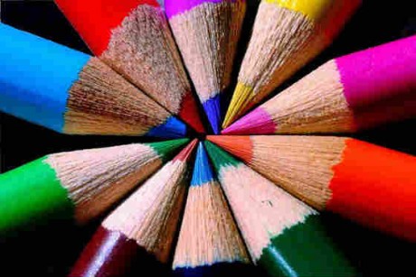
Colours Colours Colours
Localising your Digital Marketing efforts does not just end at getting the content right and knowing where to place your call to actions. It is very much about colour scheme, and what each colour stands for. You got to think outside the UK box and find out what people in the market you are targeting associate with specific colours. At the end of the day do you really want to offend your target audience because your “buy now” button on your page is a certain colour?
So lets have a look at some colours that could get you into real trouble:
RED: red is good right? Passion, Love … well not in Germany were it mainly is associated with being unlucky and can be associated with debt or no money – So not really a good colour for your buy now button if you want to convince those good old Germans to part with their pennies. But then again you would rock the Chinese market as it stands for good fortune.
GREEN: oh glorious green, calm, summer just a breath of fresh air. Well not if you want to target some of the eastern European countries where it is seen as being deceptive. Also if you would like to target the Middle East, just a hint, it is the colour for “Islam”. However, don’t start re-branding everything to green, people there normally do not receive the use of the colour very well. But hey you can always rely on the US where it stands for wealth and money – just like their dollar bills.
ORANGE: just because there is a large successful telecom company that uses this colour it doesn't mean people around the world love it. You might be a hit in the Netherlands (stands for their royal family) but you might not be such a hit in Ireland – you wouldn't want to start a political uproar, or would you?
WHITE: it must be good right? Starting on a white canvas! You would think you can’t go wrong with a colour that is blank. But then again in Asia and India it is associated with mourning and death – you don’t really want to have that effect on your potential customers.
Choosing the right colour scheme is important, identifying where and where not to use a certain colour to make your website, product or service stand out positively, can be a real challenge. But don’t despair, a long list of companies before you have tackled the same problem and there is various cultural analysis with regards to colour.
The Power of Words
I hope you still remember when I mentioned that it is really important to get that local person on board who understands the market – and incidentally could point out to you if you are going really wrong with a word or two.

Well if you think you would never get your words wrong then have a look at my list of top 4 companies “when world domination stumbles over a word”
4. Nike: A global brand with millions and millions to spend on their marketing. One would think they would have some pennies to spare to get their language research right. In the late 90s they released their “flaming air” logo into the Arabic market. Nobody realised that it resembled the word “allah”, the result, they had to pull almost 40,000 pairs of sneakers
3. General Electrics: The easiest way to enter a new geographical market is to partner with an established brand. And why not create a new name, a combination of both names? What an idea! So they decided to call it GPT. Doesn't tell you much? Well it told the French who pronounce it Jâ ai pa ta or for us non-French speakers “I have farted!”
2. Colgate: They launched their new toothpaste in France called “Cue” just like a very popular porn magazine.
1. Coca Cola: Oh yes – the one and only! Could they possibly get it wrong? Yes they can and they DID! And the country they chose to get it really wrong was China. Where they thought it would be a great idea to translate their brand name to Kekoukela – which read for Chinese people “Female Horse Stuffed with Wax”. Mmmm yum, extra tasty. After realising their mistake they searched through the whole 7000 signs (Chinese alphabet) to find one that would be ‘more suitable’ and chose “Happiness in the mouth”. Nice!
You still think it cannot happen to you? I would strongly recommend checking with a local on your content, colour scheme and the meaning of your brand in the country you are targeting. Do you really want your business to be a laughing stock in your new market– not after all that effort, right?! Don’t let your world domination plans end with a bitter after-taste.